12
Designing Sarang
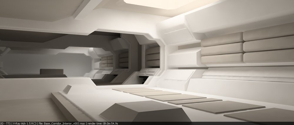
One of the most satisfying bits of work I did on Moon was designing the set. I had free reign to come up with a moon base concept that we were actually going to build in it's entirety, so it was an exciting prospect. Duncan and I had been chatting general moon base stuff whilst getting the script together so by the time I started the actual design process I'd already pretty much got it in my head. So I went straight to 3D and started boshing it out. The only thing Duncan really wanted was a main corridor that was kind of shaped like a key so I took this and incorporated a split-level roof. I knew I wanted to have the facility white and lit primarily with bounced light rather than direct light sources. The image below is the first render I did of the Sarang set.
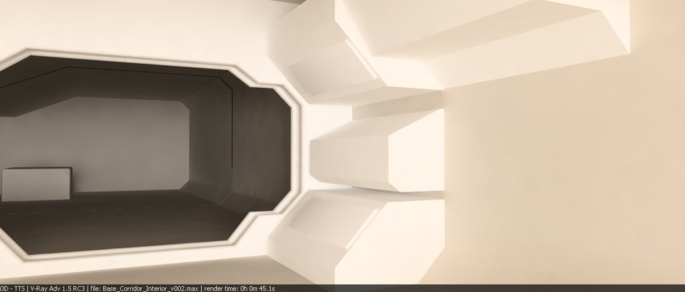
I usually start a design with a key shape or detail and as I had the bulkhead pressure-seals in mind for the entire base it felt like a good place to start. I was lighting the CG set with real-world equivalent lights right from the beginning in an attempt to get a clear idea of what we might eventually end up with in the studio.

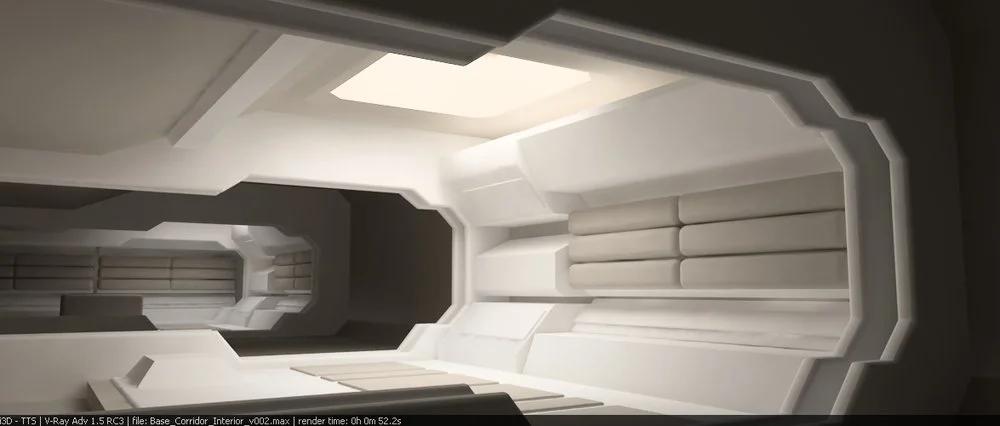
I then worked a bit of detail into the walls to try and make it look a bit more industrial. I put the padded units on to soften things up and give it a slightly "furnished" hint, so it suggested a degree of comfort and of being somewhat of a living space. The lights in this render were becoming a bit pinky so I dialed them down a bit to see what it looked like.

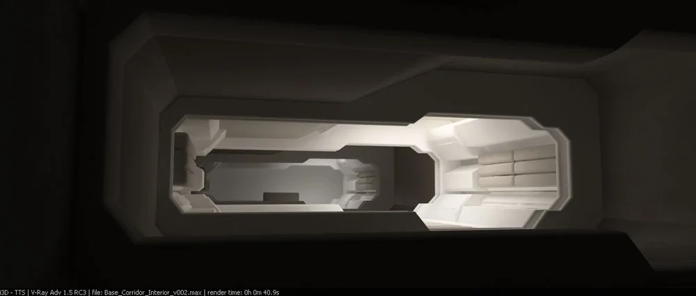
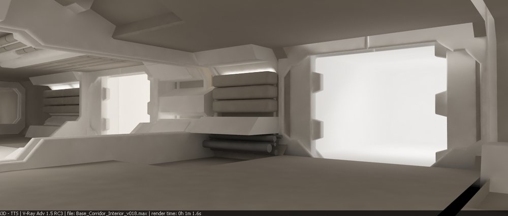
Bingo! This was the first render I did where I was sure the design was going to actually work. You can see the light-source in this image which is suggestive of a skylight. The intention is for a large, diffuse light to bounce down into the set and give everything a soft light with no harsh shadows, It's quite a gentle light. As the light in the base was designed to bounce, this was one of the main reasons I wanted the bulkheads in there. My thoughts were that we could light each bay individually with it's own "skylight", and the bulkheads would act as baffles for the light. This way we could pretty much contain the light to a single bay and step the next bay into darkness.
I put some more detail into the background and duplicated the entire bay with the skylight and got the image above. You can see how the lights are alternately on and off in the different bays down the length of the corridor. I thought this would be a nice visual device to use when we were filming as we could make the set look quite dramatic and also make it seem bigger. I really wanted the corridor to feel like a large space. Also, by moving the camera in and out of darkness we could really establish a mood. We could have Sam walking into darkness and becoming silhouetted or do things like having Gerty emerging from the shadows at any point. Can't hurt having these sort of framing options when you're shooting.
This is what the view looks like with the camera in a dark bay. You can already get a sense of mood, even at this early design stage. I think we could have taken this further in the film but as time was so short I was trying not to bother the DoP too much by constantly asking him to turn this or that light off or on.
I always intended the set to be lit with indirect light that was bouncing around off the surfaces. As the set was to be enclosed it was important for all the light sources to be designed in there rather than the normal style of filmmaking where every setup has re-positioned lights being moved around off-camera. This also gave us the bonus feature of being able to move onto other setups really quickly as way less kit needed to be moved.

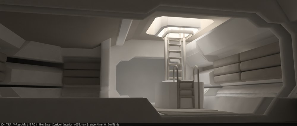
The ladder to the Monitor Room was originally supposed to be more of "an event" in the base design but as we ran out of money it ended up being a metal ladder painted orange with tennis racket grips wound round it. I remember when these grips were being applied; the art department was getting pretty down about how tight our resources were. It didn't help that I'd stolen their vacuum cleaner and plaited it orange for the Gerty hair-cutting scene. Everything was getting grabbed and pulled to pieces or being used to dress the set. You can see how with the ladder, I originally went for something much more substantial as I wanted there to be a bit of a climb that was very brightly lit. I liked the idea of this ladder sat in the darkness with a bright light beaming down and framing it in a kind of spotlight.

The nice thing about the design language of the corridor bulkheads are that they translate nicely into tasty-looking pressure doors that are clearly Science Fiction. I love the look of these sorts of things in Sci-Fi. This is the view of the rec room whilst it was just a white space. The main corridor was designed first, then the airlock, infirmary, sleeping quarters and finally the rec room. In the render above it's just a placeholder white box to give the impression of an illuminated space.
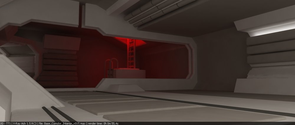
I did briefly play with the idea of having the monitor tower illuminated all in red light, kind of like the emergency lights in Aliens. It totally broke the clean design I had going on and so I abandoned it immediately. Goodbye shitty red light! I hate you!

Here we see some 3DSMax bipeds standing in for our hero for scale. We could tell from this image that the space was going to be quite large and nice to film in. This was good as we needed to get a Motion Control robot and associated track and support kit in there for some of the scenes.

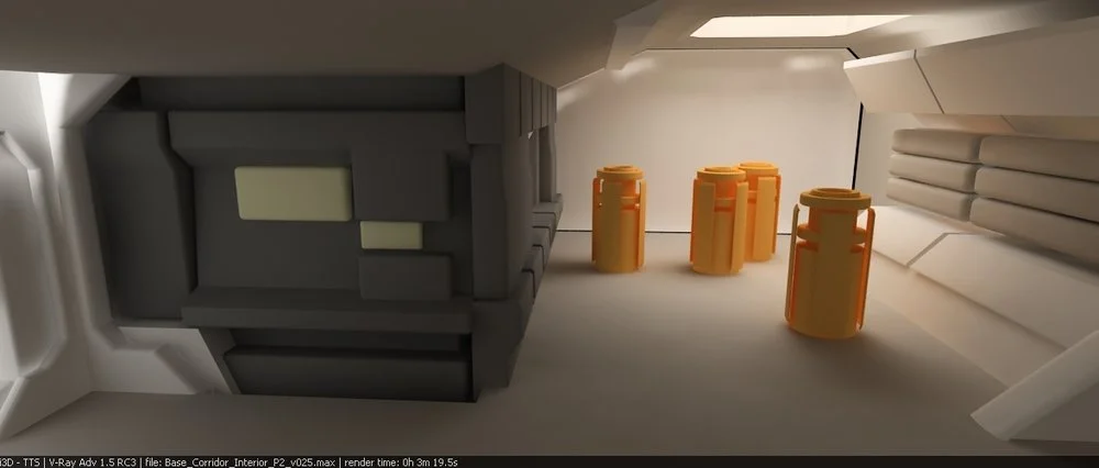
Originally I had the return vehicle as a series of silos in the floor that Gerty would use the big arm to load the canisters into. As the rail gun was underneath the base this made sense but when the script developed and Sam needed to get into the return vehicle this complicated things massively. So we changed it to more of a lift that he could load up his kit and lie down in. In the film we see Sam lift two modules out of the lift mechanism to make room for himself. These units each held two HE3 canisters and weighed an absolute ton. They were solid wood and barely lift-able and everybody hated moving them around.
I always liked the look of the two big doors open next to each other. We got a couple of shots into the film with this framing and I always liked the way it ended up looking. Sci-Fi-door action is pleasing.

I originally had this design on the back wall of the infirmary. A big cross. Because he is in hospital. What a cock. I get annoyed at myself when I do something that's very literal. I don't know why I didn't just make the whole base design look like a giant space-helmet. I surpassed myself with this next image.

Ooh, look, it's all bathed in green light now because green is the colour of operating theatres and also tends to be associated with wellness. It's also a massive pharmacy sign. What the hell was I thinking? Goodbye Forever!

Originally the greenhouse area where Sam grows his plants was going to be a disused airlock. I designed this into the base but we needed more room to film it and so we opened it out into a vague grey area walled with bread crates spray painted with some stickers on and lights behind them. That's movie magic!

This is the initial design of the airlock and pretty much stayed as it is shown here. The placeholder space suits hanging up were me testing out what bright orange suits would do to the ambient light in the set as I wasn't sure how much it would bounce. Nothing to worry about. I still wonder if we should have gone with the orange suits.
I tried the same thing with the HE3 canisters. This is a reworked version of the cargo-loading machine and is closer to how it ended up in the film.


Most of the base design changed very little from my original designs as I just sort of blurted it all out straight into 3D. In the images above we see the corridor to the "return vehicle" (clone-burning-box). This part of the set always used to annoy me as the sloped floor was made of wood and it used to flex and creak a bit as you walked up it. I tried to get it stabilized but as it would have meant ripping quite a bit of the set apart to get under it we just had to leave it. Always annoyed the shit out of me though. If you look at the graphic on the floor right in front of the door on the set as it appears in the film, you'll see a grey shape which kind of looks like the Millennium Falcon. I painted this on there as a shout out to Ralph McQuarrie, one of the greatest Science Fiction artists that have ever lived.

This is the view approaching the infirmary with the "night-time" lighting scheme on. We had two lighting configuration on-set, "Day" and "Night". I'm not sure how clear this comes across in the film but I think touches like these really help establish a mood behind everything else and are worth putting in. I'm not quite sure how the sense of geography came across in the film, or if the layout of the base is particularly clear in the final edit. The diagram below is an outline of the base hi-lighting the Gerty rail apparatus. As you can see, there are areas of the station that he actually has no access to. We never see him in Sam’s' bedroom even though one of his jobs is to clean-up after the "removal" of an expired clone. Exactly how he achieves this is simply a space-mystery and definitely not because we forgot or overlooked anything.

Even though this was just a quick screen-grab of the 3D layout of the set, I ended up re-purposing it and using it as a lightbox graphic above the main terminal as the "Fire Control" graphic.

The animation below is a CG fly-through I did to give more of a sense of space and to show how everything is connected together (sorry about the file-size). These renders went down really well at meetings and the whole CG design sequence turned out to be incredibly useful as the construction department could take the 3D models and immediately start working with them. Also, when we came to pre-light the set we had of a blueprint for light placements and a decent idea of what it was supposed to look like as reference.
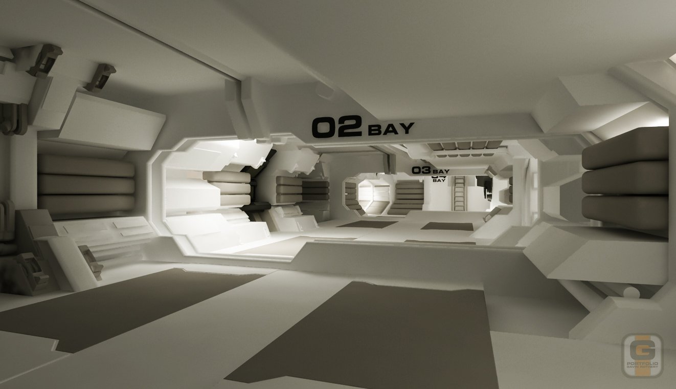
Here's a few images of the final CG base model from my folio. It was a weird thing designing this base and then having the thing built for real as walking around it was like being inside my own head, it was a real "Being John Malkovitch" experience for me. The design process took around a week when all said and done, with most of the work being done up front and then a few tweaks and "finishing off" being completed a couple of weeks later over a day or two. It was really nice getting to spend a few weeks in Sarang whilst we were filming and strange how I wasn't upset at all when I saw the set being smashed to pieces at the end of the shoot. I'm not sure exactly what this says about me or how knackered I was at the time but at the end of all the violent destruction it made a hell of a big bonfire.